Building a heart screening tool
It is mobile-assisted intelligent system that helps support the early screening of heart abnormalities by analyzing heart sounds recorded through a smartphone. Using LSTM model, the system classifies heart sounds as normal or abnormal, providing a simple and accessible screening tool. AuscultAI is designed to assist medical professionals, especially in areas with limited access to specialized healthcare.
Role
Role
UI/UX & Frontend Developer
UI/UX & Frontend Developer
Status
Status
Complete
Complete
Year
Year
2024
2024
Tools
Tools
Figma • Python • Flutter
Figma • Python • Flutter
Problems
Access to heart screening is limited - cost, location, and lack of specialists delay detection.
Traditional auscultation is subjective and inconsistent, relying heavily on clinician experience.
Regular screening is unavailable in resource-constrained areas.
Solution
A mobile-assisted, AI-powered heart sound screening system.
Smartphone recordings analyzed by deep learning and classified as normal or abnormal.
Accessible, consistent, supportive - flags cases needing further medical evaluation.


Onboarding
Guiding Users Without Overloading Them
Before recording, users go through a short onboarding flow that shows how to properly capture heart sounds across specific areas of the chest.
The focus here was clarity over instruction-heavy design. Visual guides and graphs were designed to be understandable at a glance, even without reading detailed text.
By keeping the experience minimal and visually driven, the onboarding helps users perform accurate recordings from the start without feeling overwhelmed.
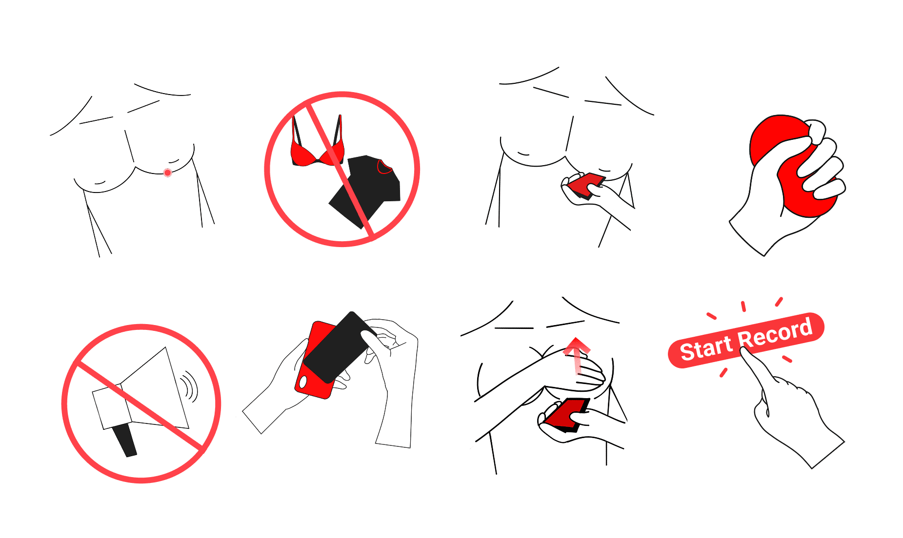
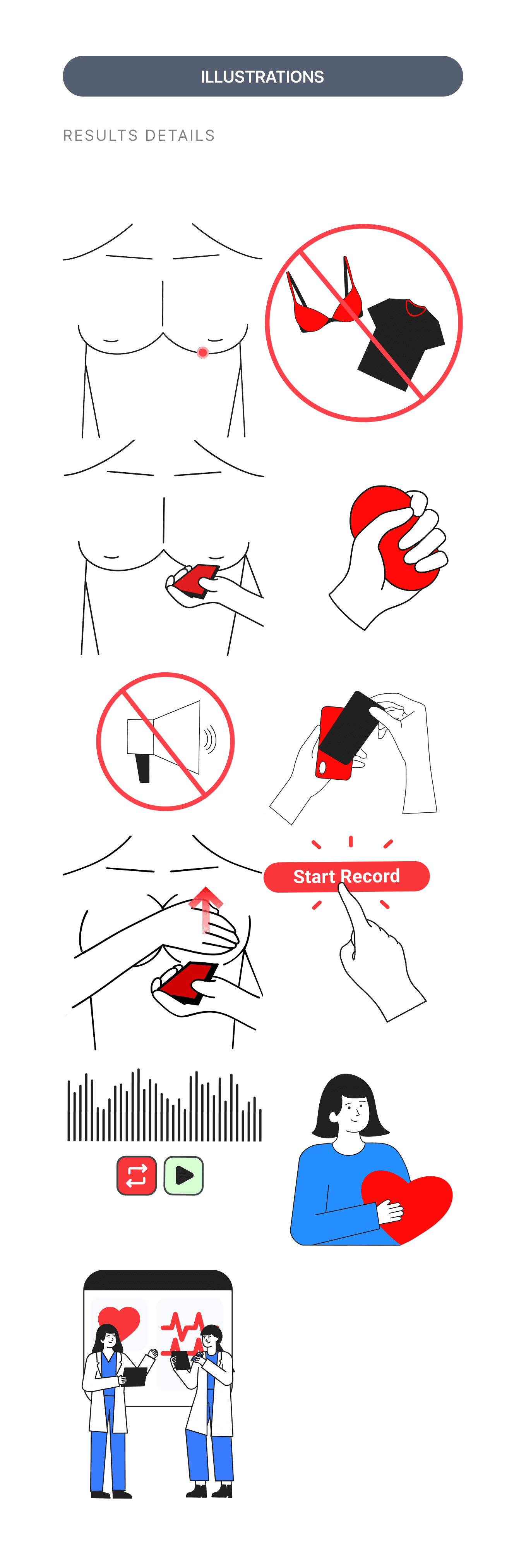
Image 1. Illustrations created to help users quickly understand the instructions at a glance.
Image 1. Illustrations created to help users quickly understand the instructions at a glance.
Core flow
Designing a Supportive Recording Experience
The main journey of Home, Settings, Record, Recording, and Processing was designed to feel simple and reassuring from start to finish.
Home acts as a personal archive, giving users a sense of ownership over their recordings
Settings provides quick access to instructions and educational content
Record and Recording focus on the critical moment, removing distractions and guiding users with clear cues and a countdown
Processing bridges the gap between action and result, using a human-centered illustration to make the AI feel more approachable
Each step is intentional, reducing friction while keeping users informed and supported throughout the process.


Image 2. Pages of the workflow
Image 2. Pages of the workflow
Results
Making the Outcome Clear and Meaningful
The Results, Relisten, and About screens were designed as a single “moment of truth” where users understand, verify, and learn from their results.
Results presents the classification with confidence levels and a clear explanation, avoiding overly technical language
Relisten allows users to hear their own heartbeat, connecting the analysis to something tangible
About provides deeper context, explaining heart sounds, patterns, and what they mean
Together, these screens balance clarity, transparency, and education—giving users not just an answer, but a better understanding of it.


Onboarding
Guiding Users Without Overloading Them
Before recording, users go through a short onboarding flow that shows how to properly capture heart sounds across specific areas of the chest.
The focus here was clarity over instruction-heavy design. Visual guides and graphs were designed to be understandable at a glance, even without reading detailed text.
By keeping the experience minimal and visually driven, the onboarding helps users perform accurate recordings from the start without feeling overwhelmed.
Image 1. Illustrations created to help users quickly understand the instructions at a glance.
Core flow
Designing a Supportive Recording Experience
The main journey of Home, Settings, Record, Recording, and Processing was designed to feel simple and reassuring from start to finish.
Home acts as a personal archive, giving users a sense of ownership over their recordings
Settings provides quick access to instructions and educational content
Record and Recording focus on the critical moment, removing distractions and guiding users with clear cues and a countdown
Processing bridges the gap between action and result, using a human-centered illustration to make the AI feel more approachable
Each step is intentional, reducing friction while keeping users informed and supported throughout the process.
Image 2. Pages of the workflow
Results
Making the Outcome Clear and Meaningful
The Results, Relisten, and About screens were designed as a single “moment of truth” where users understand, verify, and learn from their results.
Results presents the classification with confidence levels and a clear explanation, avoiding overly technical language
Relisten allows users to hear their own heartbeat, connecting the analysis to something tangible
About provides deeper context, explaining heart sounds, patterns, and what they mean
Together, these screens balance clarity, transparency, and education—giving users not just an answer, but a better understanding of it.
Designing with empathy
A lot of this project came down to empathy with patients. Even a simple instruction had to be clear and well illustrated, and that pushed me to think about inclusivity early. A woman's chest isn't the same as a man's, so I drew a separate illustration for that and accounted for things like a bra, rather than leaving it as an afterthought.
Working with the model and hardware
On the technical side, I got to train a deep learning model and clean up noise from the audio, since we were recording a heartbeat through a phone against the chest. I also brought the app to iPhone, which was my first time setting up a project in Xcode and getting it running on a real device.
Communicating results responsibly
And in the design itself, I learned to word things carefully so patients don't panic, like how to phrase how confident the model is in its result.
Designing with empathy
A lot of this project came down to empathy with patients. Even a simple instruction had to be clear and well illustrated, and that pushed me to think about inclusivity early. A woman's chest isn't the same as a man's, so I drew a separate illustration for that and accounted for things like a bra, rather than leaving it as an afterthought.
Working with the model and hardware
On the technical side, I got to train a deep learning model and clean up noise from the audio, since we were recording a heartbeat through a phone against the chest. I also brought the app to iPhone, which was my first time setting up a project in Xcode and getting it running on a real device.
Communicating results responsibly
And in the design itself, I learned to word things carefully so patients don't panic, like how to phrase how confident the model is in its result.
More Work

SchedRx
Turning a photo of a prescription into a medication schedule
SchedRx is an iOS app designed to simplify prescription management through Intelligent automation using OCR and NER. It reads printed prescriptions, extracts essential medical information, and generates medication schedules and reminders—customized for the Philippine context.

West Select
The curated marketplace for campus life
The goal of West Select is to provide a centralized, campus-exclusive e-commerce platform for West Visayas State University, enabling students and recognized organizations to easily buy and sell items within a trusted university community.