The curated marketplace for campus life
The goal of West Select is to provide a centralized, campus-exclusive e-commerce platform for West Visayas State University, enabling students and recognized organizations to easily buy and sell items within a trusted university community.
Role
Role
UI/UX & Frontend Developer
UI/UX & Frontend Developer
Status
Status
Complete
Complete
Year
Year
2024–25
2024–25
Tools
Tools
Figma
Figma
Problems
Student commerce was scattered across Facebook groups — hard to search, easy to miss.
No trust layer — anyone could post, and buyers had no way to verify sellers.
Transactions were high-friction: negotiation, payment, and meetups all improvised.
Solution
A campus-exclusive marketplace — Google Sign-In with university-linked emails keeps it trusted.
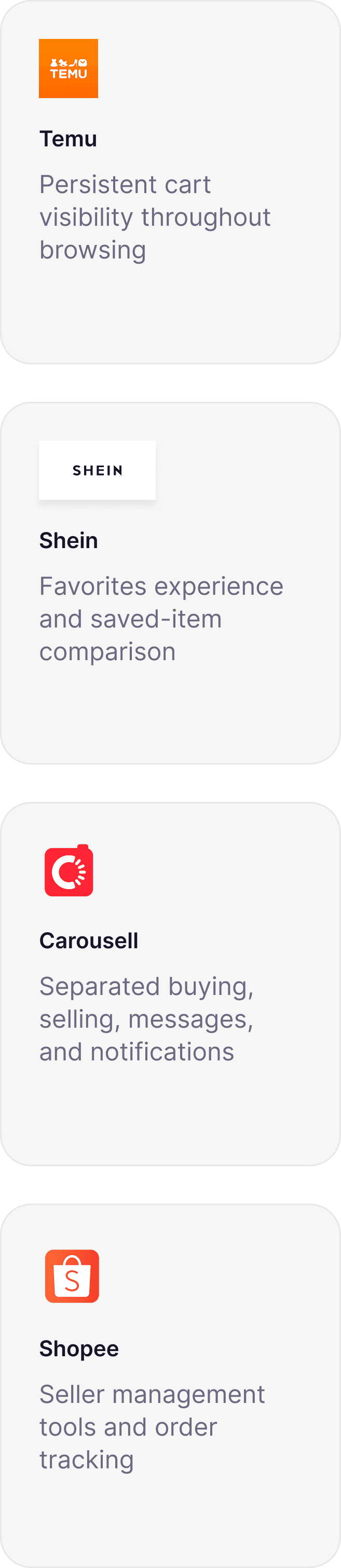
Proven e-commerce patterns (Temu, Shein, Carousell, Shopee) adapted to campus life instead of reinvented.
Low interaction cost — minimal taps, reusable components, in-person exchange instead of online payments.



Project Overview
Bringing student commerce into one trusted marketplace
West Select is a campus-exclusive marketplace designed for the West Visayas State University community. Built as part of our Entrepreneurship project, it centralizes buying and selling for students, organizations, colleges, and Binhi incubators within a single trusted platform.
Before West Select, transactions primarily happened through Facebook groups. Listings quickly disappeared in crowded feeds, conversations moved to Messenger, and there was no dedicated place to manage products or purchases. The experience worked, but it wasn't designed for commerce.
Rather than reinventing online marketplaces, our goal was to bring together familiar shopping patterns in a platform tailored to student life.
The problem
Facebook groups were the marketplace
Listings vanished in crowded feeds, deals moved to Messenger threads, and there was no dedicated place to manage products or track purchases.


Design Approach
Familiar experiences reduce the learning curve
Students already understand how marketplaces work. Rather than inventing new interactions, I studied what already feels intuitive and adapted it.

Information Architecture
Five areas, five distinct intents
The marketplace is built around five primary navigation areas:
Home
Favorites
Messages
Inbox
Profile
Each section represents a distinct task rather than simply grouping features. Product discovery, communication, transaction updates, and account management remain separate, helping users quickly understand where to go without unnecessary navigation.

Interaction Cost
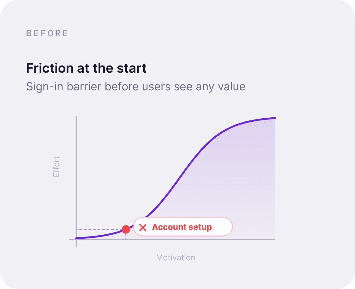
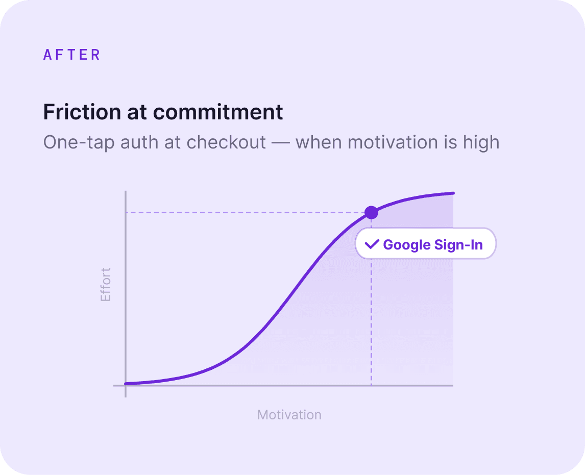
Place friction where motivation is highest
The Home experience focuses on making products easy to discover without overwhelming users.
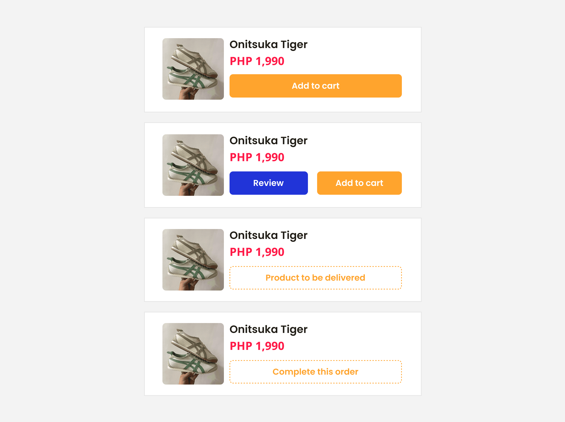
Students can browse listings posted across the university, search for specific products, explore categories, and save items to Favorites for later. Instead of interrupting browsing with additional steps, discovery remains lightweight and familiar.
The Favorites feature supports comparison shopping by allowing students to bookmark products before deciding to purchase, reducing the need to repeatedly search for the same listings.
The Screens
Sign in. Browse. Buy.
The first three moments in every student's West Select experience authentication, discovery, and product detail all designed to reduce friction.


Communication
Conversations vs. transaction updates
Marketplace communication serves two different purposes. Instead of mixing them, West Select gives each its own dedicated space.



Profile
One profile that supports both buyers and sellers
Students often switch between buying and selling, so creating separate interfaces for each role would only add unnecessary complexity.
Instead, the Profile screen adapts to support both experiences within a single account.


Order Management
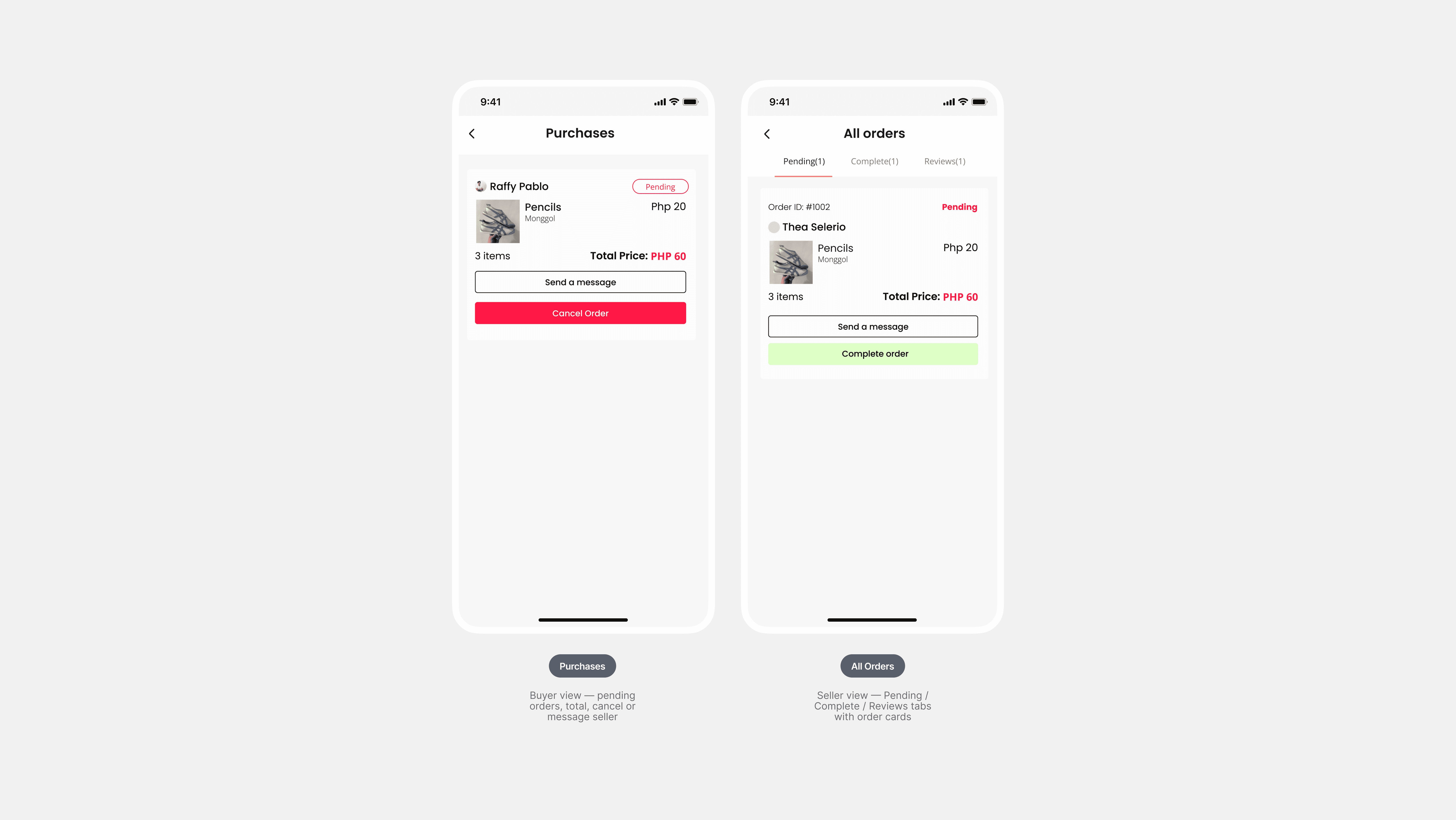
Track every purchase, manage every order
Simplified through one-sided cancellations and clear status tabs. Buyers track their purchases; sellers manage fulfillment each with just what they need.

Seller Tools
Everything a seller needs in two screens
Create a listing and manage your inventory both without leaving the profile. Tabs for Listed, Soldout, and Delisted keep the catalogue organised as it grows.


Project Overview
Bringing student commerce into one trusted marketplace
West Select is a campus-exclusive marketplace designed for the West Visayas State University community. Built as part of our Entrepreneurship project, it centralizes buying and selling for students, organizations, colleges, and Binhi incubators within a single trusted platform.
Before West Select, transactions primarily happened through Facebook groups. Listings quickly disappeared in crowded feeds, conversations moved to Messenger, and there was no dedicated place to manage products or purchases. The experience worked, but it wasn't designed for commerce.
Rather than reinventing online marketplaces, our goal was to bring together familiar shopping patterns in a platform tailored to student life.
The problem
Facebook groups were the marketplace
Listings vanished in crowded feeds, deals moved to Messenger threads, and there was no dedicated place to manage products or track purchases.
Design Approach
Familiar experiences reduce the learning curve
Students already understand how marketplaces work. Rather than inventing new interactions, I studied what already feels intuitive and adapted it.
Information Architecture
Five areas, five distinct intents
The marketplace is built around five primary navigation areas:
Home
Favorites
Messages
Inbox
Profile
Each section represents a distinct task rather than simply grouping features. Product discovery, communication, transaction updates, and account management remain separate, helping users quickly understand where to go without unnecessary navigation.
Interaction Cost
Place friction where motivation is highest
The Home experience focuses on making products easy to discover without overwhelming users.
Students can browse listings posted across the university, search for specific products, explore categories, and save items to Favorites for later. Instead of interrupting browsing with additional steps, discovery remains lightweight and familiar.
The Favorites feature supports comparison shopping by allowing students to bookmark products before deciding to purchase, reducing the need to repeatedly search for the same listings.
The Screens
Sign in. Browse. Buy.
The first three moments in every student's West Select experience authentication, discovery, and product detail all designed to reduce friction.
Communication
Conversations vs. transaction updates
Marketplace communication serves two different purposes. Instead of mixing them, West Select gives each its own dedicated space.
Profile
One profile that supports both buyers and sellers
Students often switch between buying and selling, so creating separate interfaces for each role would only add unnecessary complexity.
Instead, the Profile screen adapts to support both experiences within a single account.
Order Management
Track every purchase, manage every order
Simplified through one-sided cancellations and clear status tabs. Buyers track their purchases; sellers manage fulfillment each with just what they need.
Seller Tools
Everything a seller needs in two screens
Create a listing and manage your inventory both without leaving the profile. Tabs for Listed, Soldout, and Delisted keep the catalogue organised as it grows.
Presentation and research
We were presenting this to the school, so it had to look clean and polished, and I picked up a lot about mockups along the way. I spent a good while researching apps like Shopee, Carousell, and Shein to see which patterns keep coming up.
Designing for both sides of the market
Past the interface, I had to think about both the seller and the buyer, plus a bunch of edge cases like reporting and comments, and how the whole thing would hold up if it grew. My biggest takeaway ended up being less about the design itself and more about how you actually market the app.
Presentation and research
We were presenting this to the school, so it had to look clean and polished, and I picked up a lot about mockups along the way. I spent a good while researching apps like Shopee, Carousell, and Shein to see which patterns keep coming up.
Designing for both sides of the market
Past the interface, I had to think about both the seller and the buyer, plus a bunch of edge cases like reporting and comments, and how the whole thing would hold up if it grew. My biggest takeaway ended up being less about the design itself and more about how you actually market the app.
More Work

AuscultAI
Building a heart screening tool
It is mobile-assisted intelligent system that helps support the early screening of heart abnormalities by analyzing heart sounds recorded through a smartphone. Using LSTM model, the system classifies heart sounds as normal or abnormal, providing a simple and accessible screening tool. AuscultAI is designed to assist medical professionals, especially in areas with limited access to specialized healthcare.

SchedRx
Turning a photo of a prescription into a medication schedule
SchedRx is an iOS app designed to simplify prescription management through Intelligent automation using OCR and NER. It reads printed prescriptions, extracts essential medical information, and generates medication schedules and reminders—customized for the Philippine context.