Making word-of-mouth gigs findable
SideQuest is a small scale concept project , designed to address the lack of accessible job opportunities and the growing need for manual work. It functions as a mission-style job board where users can either post tasks or take on short-term jobs, with all coordination handled through in-app messaging.
Role
Role
Product Designer
Product Designer
Status
Status
Complete
Complete
Year
Year
2024
2024
Tools
Tools
Figma
Figma
Problems
Job opportunities spread by word of mouth only — access depends on who you know.
Manual workers face feast-or-famine days with no reliable pipeline.
Existing platforms feel too formal for one-day, task-based work.
Solution
A mission-style job board — post tasks or take them on like quests.
ID verification at onboarding builds trust for real-world, in-person work.
Color-coded activity cards make roles and progress readable at a glance.


Context
Access to short-term work is often inconsistent and highly dependent on personal networks.
Most opportunities are shared through word-of-mouth, making them difficult to discover unless you already know the right people.
At the same time, many individuals are willing to take on manual or flexible work, while others need quick help without committing to formal services or long-term contracts.
This gap highlighted a simple opportunity:
make small jobs easier to find, easier to post, and easier to accept.
My Research Insights
Through conversations, observations, and personal experience, a few clear patterns emerged:
Job discovery is network-dependent
Work availability is inconsistent and unpredictable
Existing platforms feel too formal or heavy for small tasks
People prefer quick, direct, and flexible arrangements
Common sentiments included:
“You only hear about jobs if someone recommends you.”
“Some days there’s work, some days there’s none.”
“I just need someone reliable for a day or two.”
“There’s no place to look for small jobs.”

Design Direction
Instead of competing directly with platforms like LinkedIn or Facebook, SideQuest was positioned as a lighter, more approachable alternative focused purely on short-term tasks.
The core principles were:
Simplicity over features
Speed over process
Flexibility over structure
The experience was designed to feel intuitive and slightly playful, borrowing subtle cues from game systems (quests, missions), while still staying clear and usable.
Core experience
SideQuest allows users to participate in two roles:
Job Posters — create and assign tasks
Quest Takers — browse and accept jobs
Instead of rigid workflows, users can:
set their own rates
choose which jobs to accept
communicate directly through messaging
This keeps interactions flexible and removes unnecessary friction.
Onboarding
Introducing Structure Without Slowing People Down
Onboarding needed to establish trust without feeling like a barrier.
I avoided long forms and broke the flow into three short steps: account setup, basic information, and ID verification.
The key decision here was placing verification early. Since the platform involves real-world interactions, trust isn’t optional,it’s expected. By setting that upfront, users understand the level of accountability from the beginning.
At the same time, each step is kept minimal to avoid overwhelming new users. The goal was to make onboarding feel like setup, not a process.


Job creation and Hiring
Posting and filling a job should feel quick, not like a formal process.
Most platforms treat this as two heavy steps, creating a listing and then going through structured hiring. That works for long-term roles, but it creates friction for small, short-term tasks.
Here, both are simplified.
Creating a quest focuses only on what matters: task, time, location, and budget.
No unnecessary fields, no long forms.
Once posted, users can immediately browse applicants, review lightweight profiles, and message directly. There’s no formal application process—just quick evaluation and conversation.
When someone is selected, the interface shifts to focus on that person and the task.
From posting to hiring, everything is designed to move fast and stay flexible.


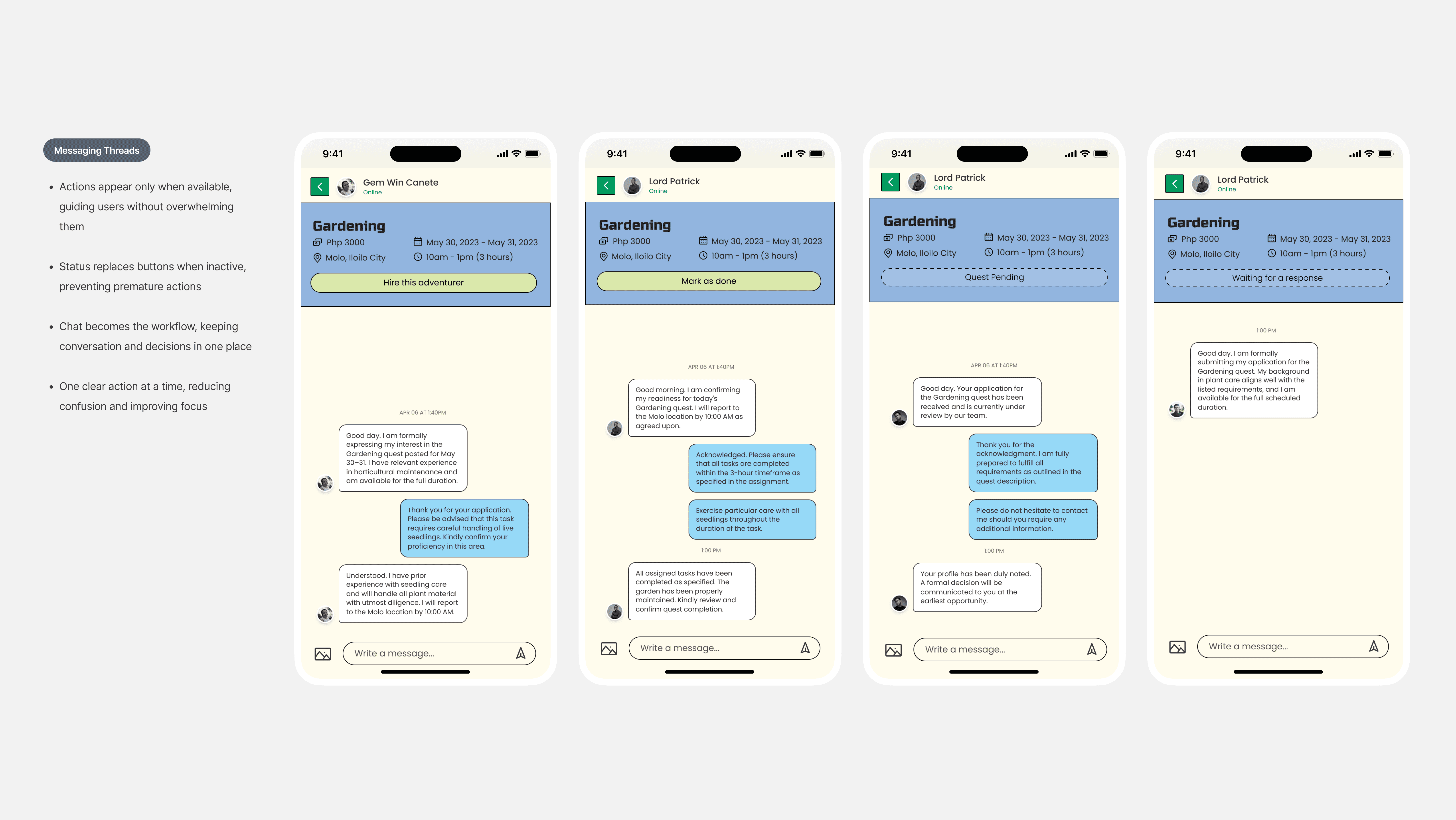
Message Threads
Work shouldn’t be separated from communication.
In most platforms, users jump between chat and task management, breaking momentum.
Here, everything happens inside the conversation.
Users can discuss, decide, and take action in one place.
Actions only appear when they’re relevant.
If something isn’t actionable yet, the system simply reflects the current state.

Activities cycle
Managing work should feel continuous, not fragmented.
Instead of splitting tasks across multiple disconnected views, the system organizes them by time.
Activity focuses on what’s happening now—ongoing or upcoming tasks that need attention.
History captures what’s already done, regardless of whether the user posted or accepted the job.
Same structure, different context: present vs past.


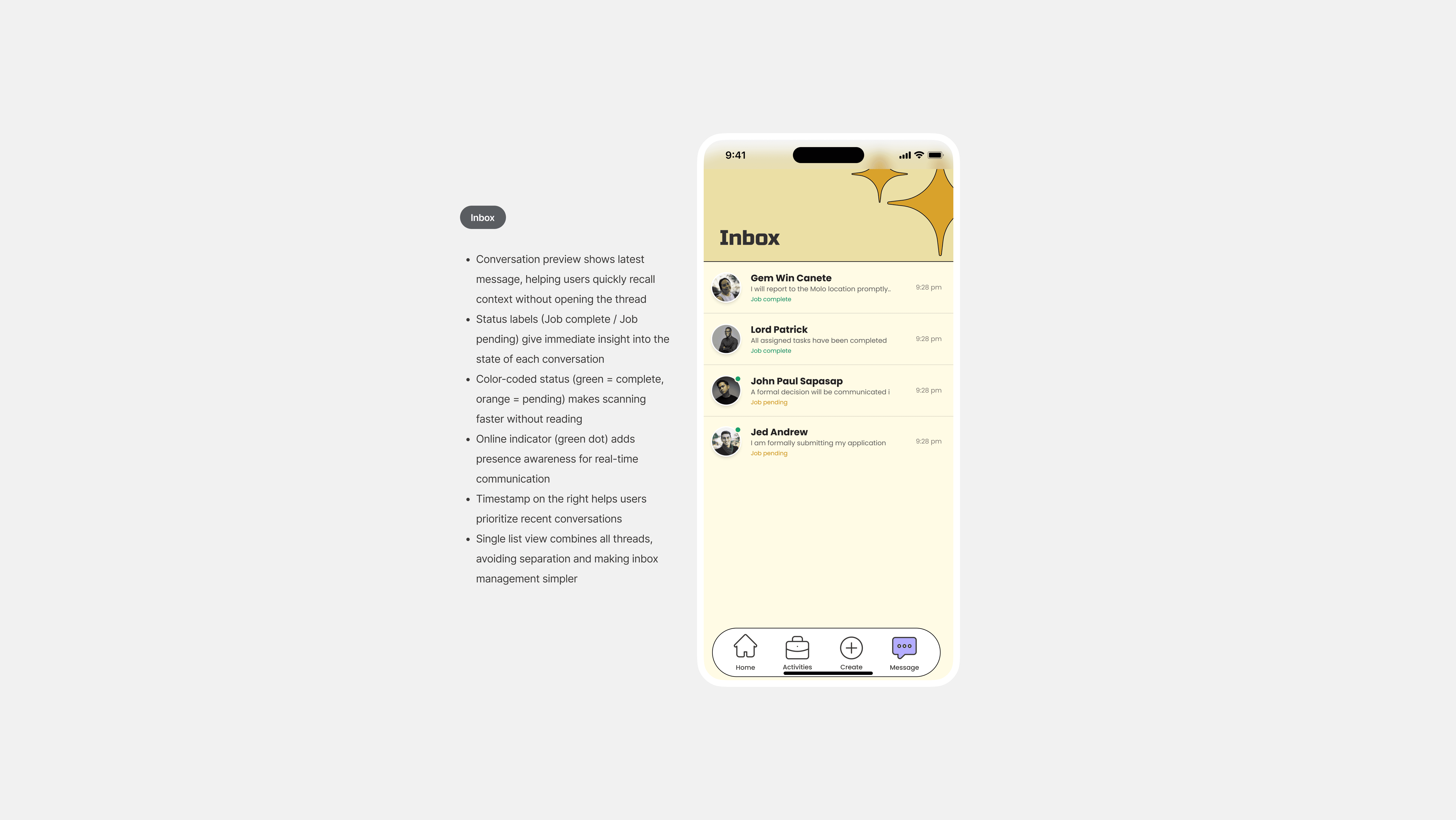
Inbox
Messages should show more than just messages.
A typical inbox forces users to open each conversation to understand what’s going on.
Here, each thread includes both the latest message and its current state—pending or complete.
Users can scan, prioritize, and act without extra steps.

Context
Access to short-term work is often inconsistent and highly dependent on personal networks.
Most opportunities are shared through word-of-mouth, making them difficult to discover unless you already know the right people.
At the same time, many individuals are willing to take on manual or flexible work, while others need quick help without committing to formal services or long-term contracts.
This gap highlighted a simple opportunity:
make small jobs easier to find, easier to post, and easier to accept.
My Research Insights
Through conversations, observations, and personal experience, a few clear patterns emerged:
Job discovery is network-dependent
Work availability is inconsistent and unpredictable
Existing platforms feel too formal or heavy for small tasks
People prefer quick, direct, and flexible arrangements
Common sentiments included:
“You only hear about jobs if someone recommends you.”
“Some days there’s work, some days there’s none.”
“I just need someone reliable for a day or two.”
“There’s no place to look for small jobs.”
Design Direction
Instead of competing directly with platforms like LinkedIn or Facebook, SideQuest was positioned as a lighter, more approachable alternative focused purely on short-term tasks.
The core principles were:
Simplicity over features
Speed over process
Flexibility over structure
The experience was designed to feel intuitive and slightly playful, borrowing subtle cues from game systems (quests, missions), while still staying clear and usable.
Core experience
SideQuest allows users to participate in two roles:
Job Posters — create and assign tasks
Quest Takers — browse and accept jobs
Instead of rigid workflows, users can:
set their own rates
choose which jobs to accept
communicate directly through messaging
This keeps interactions flexible and removes unnecessary friction.
Onboarding
Introducing Structure Without Slowing People Down
Onboarding needed to establish trust without feeling like a barrier.
I avoided long forms and broke the flow into three short steps: account setup, basic information, and ID verification.
The key decision here was placing verification early. Since the platform involves real-world interactions, trust isn’t optional,it’s expected. By setting that upfront, users understand the level of accountability from the beginning.
At the same time, each step is kept minimal to avoid overwhelming new users. The goal was to make onboarding feel like setup, not a process.
Job creation and Hiring
Posting and filling a job should feel quick, not like a formal process.
Most platforms treat this as two heavy steps, creating a listing and then going through structured hiring. That works for long-term roles, but it creates friction for small, short-term tasks.
Here, both are simplified.
Creating a quest focuses only on what matters: task, time, location, and budget.
No unnecessary fields, no long forms.
Once posted, users can immediately browse applicants, review lightweight profiles, and message directly. There’s no formal application process—just quick evaluation and conversation.
When someone is selected, the interface shifts to focus on that person and the task.
From posting to hiring, everything is designed to move fast and stay flexible.
Message Threads
Work shouldn’t be separated from communication.
In most platforms, users jump between chat and task management, breaking momentum.
Here, everything happens inside the conversation.
Users can discuss, decide, and take action in one place.
Actions only appear when they’re relevant.
If something isn’t actionable yet, the system simply reflects the current state.
Activities cycle
Managing work should feel continuous, not fragmented.
Instead of splitting tasks across multiple disconnected views, the system organizes them by time.
Activity focuses on what’s happening now—ongoing or upcoming tasks that need attention.
History captures what’s already done, regardless of whether the user posted or accepted the job.
Same structure, different context: present vs past.
Inbox
Messages should show more than just messages.
A typical inbox forces users to open each conversation to understand what’s going on.
Here, each thread includes both the latest message and its current state—pending or complete.
Users can scan, prioritize, and act without extra steps.
Stepping beyond aesthetics
This was a fun one, made with my groupmates. I was still finding my feet as a designer, and it was the first time I pushed past a clean look and went full game mode.
Reflection and craft
Looking back, I'm not totally sure the gamified angle fit our audience. But it taught me a lot about prototyping and building out frames, and about designing for two sides at once, the job seeker and the employer.
Stepping beyond aesthetics
This was a fun one, made with my groupmates. I was still finding my feet as a designer, and it was the first time I pushed past a clean look and went full game mode.
Reflection and craft
Looking back, I'm not totally sure the gamified angle fit our audience. But it taught me a lot about prototyping and building out frames, and about designing for two sides at once, the job seeker and the employer.
More Work

AuscultAI
Building a heart screening tool
It is mobile-assisted intelligent system that helps support the early screening of heart abnormalities by analyzing heart sounds recorded through a smartphone. Using LSTM model, the system classifies heart sounds as normal or abnormal, providing a simple and accessible screening tool. AuscultAI is designed to assist medical professionals, especially in areas with limited access to specialized healthcare.

SchedRx
Turning a photo of a prescription into a medication schedule
SchedRx is an iOS app designed to simplify prescription management through Intelligent automation using OCR and NER. It reads printed prescriptions, extracts essential medical information, and generates medication schedules and reminders—customized for the Philippine context.