Auditing and Rebuilding an encounter page
MyPetCare is a veterinary clinic management platform that helps clinics track patients, handle appointments, manage billing, and document medical records. As a design intern I was handed the Encounter Page, the full record of a single patient visit, covering observations, vitals, diagnoses, treatments, and the handoff to billing. The structure already existed. My job was to consolidate it, so everything a vet needs for one visit lives on one page, in one flow.
Role
Role
Product Design Intern
Product Design Intern
Status
Status
Complete
Complete
Year
Year
2026
2026
Tools
Tools
Figma
Figma
Problems
The encounter form was buried inside patient profile tabs. Reaching a visit record, or leaving it, meant clicking through several layers.
Treatments sat in a separate panel of six action buttons, split from the notes they belonged to.
Clinical details were unsafe by default. Unit labels lived in placeholder text and vanished the moment a vet started typing.
Solution
Split one crowded page into two: an encounter list for finding records, a dedicated documentation page for writing them.
Gave the SOAP form the whole screen, with treatments alongside it and a Last Encounter summary replacing the redundant to-do panel.
Leaned on conventions that already work: a data table with search, filters and counts, and units pinned outside the input where they stay visible.



Background
My first internship, my first real product
MyPetCare was the first real product I worked on as a designer. It is a veterinary clinic management platform that helps clinics track patients, handle appointments, manage billing, and document medical records. When I joined as an intern, I was handed one of the most central features in the entire app: the Encounter Page.
An encounter is the full record of a single patient visit. It captures everything that happened during that appointment:
Observations and vitals
Diagnoses
Treatments
The handoff to billing
The structure existed. The SOAP framework was there.
But using it felt scattered:
Treatment actions lived in their own separate panel
The form was nested inside patient profile tabs
My job was to consolidate it. Make the experience feel like one coherent thing rather than several loosely connected pieces.
Everything a vet needed for a single visit should live on one page, in one flow.
Starting Point
What the encounter page looked like before
This is the original design. The encounter form lived inside the patient profile page, tucked under an Encounters tab. A ‘Back to List’ link sat inside the tab, not at the top level of navigation. Treatment options were split into a separate panel on the right with six individual action buttons.
New Flow
Separating the encounter list from the SOAP notes
The biggest structural change in this redesign was splitting what used to be one crowded page into two distinct ones. The encounter list became its own page, a place to find and manage records. Selecting a visit takes you to a completely separate documentation page where the patient profile tabs disappear and the vet just has the form.

Design Decision · Navigation
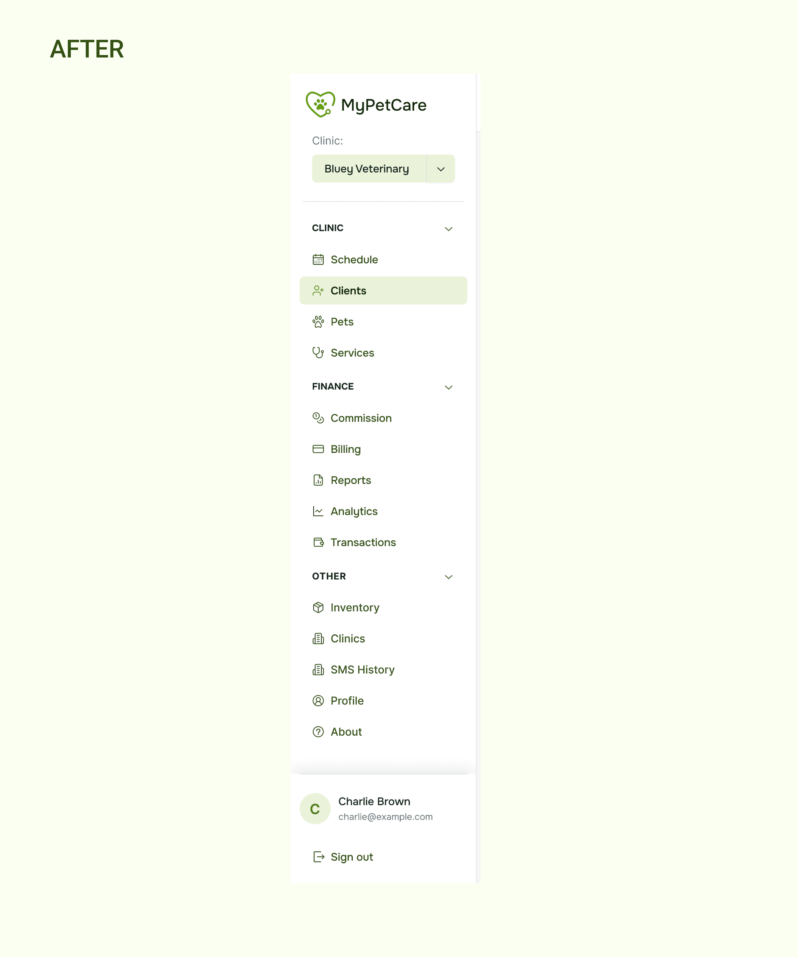
Organizing a flat nav into something scannable
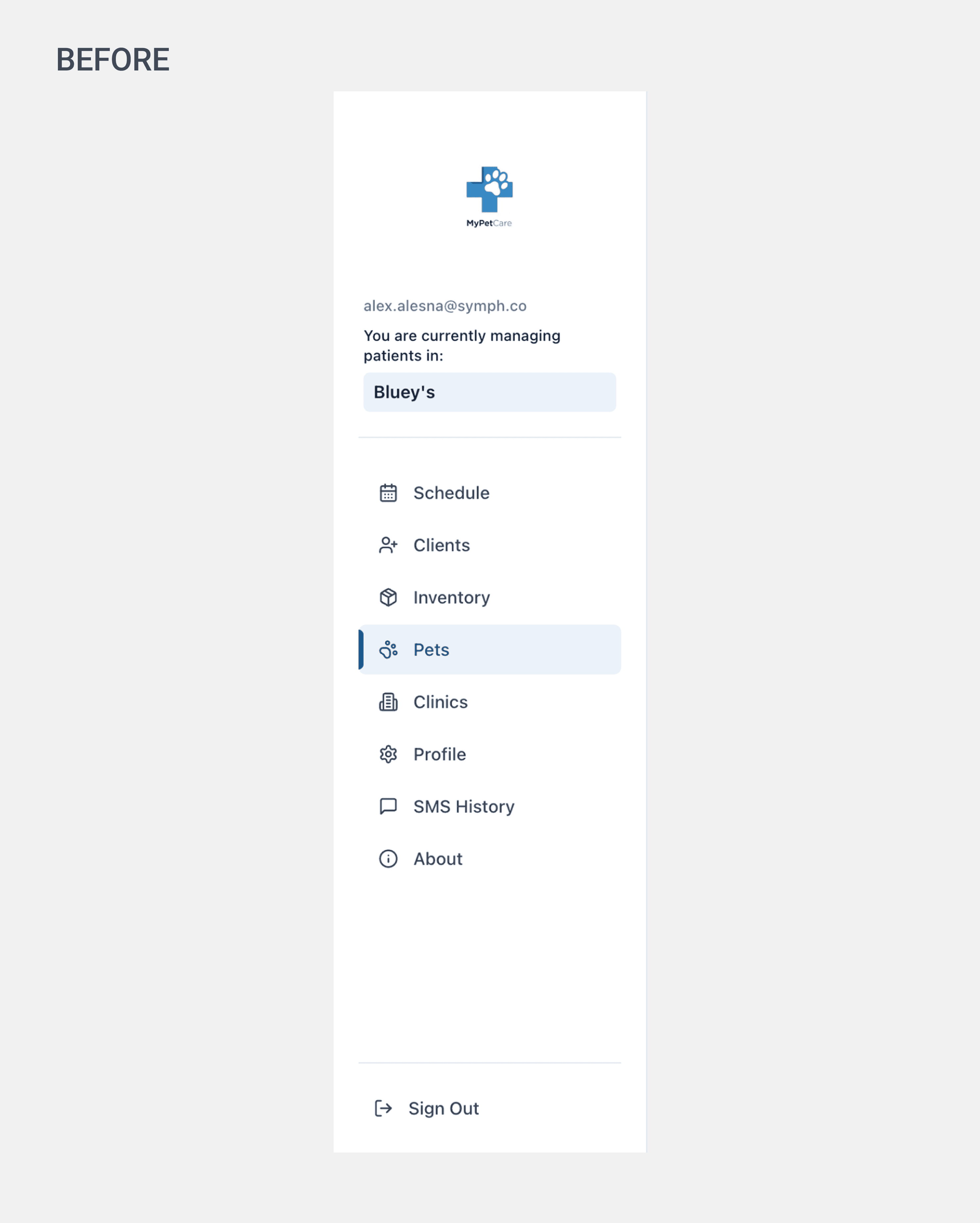
The original sidebar was a single list of eight items with no hierarchy. As the product grew, more items kept getting added to the bottom. It worked when the app was small but became harder to parse as the feature set expanded.
Design Decision · Encounter Table
A table that follows familiar, well-tested patterns
Now that the encounter list had its own dedicated page, it made sense to treat it like a proper data table rather than a minimal embedded list. I took cues from patterns like Shopify’s admin tables: search, status filters, a total count, and a dedicated action column. These conventions exist for a reason. Vets and clinic staff already know how to use them.
Design Decision · Form Fields
Unit labels that stay visible as you type
For fields like weight and temperature, the original design used placeholder text to communicate the unit. The moment a vet started typing, the ‘kg’ or ‘°C’ disappeared. In a clinical setting where the wrong unit can mean something serious, that is not a small problem. Keeping the unit pinned outside the input, always visible, removes any ambiguity.
Encounter Form
The documentation page, nothing else competing for attention
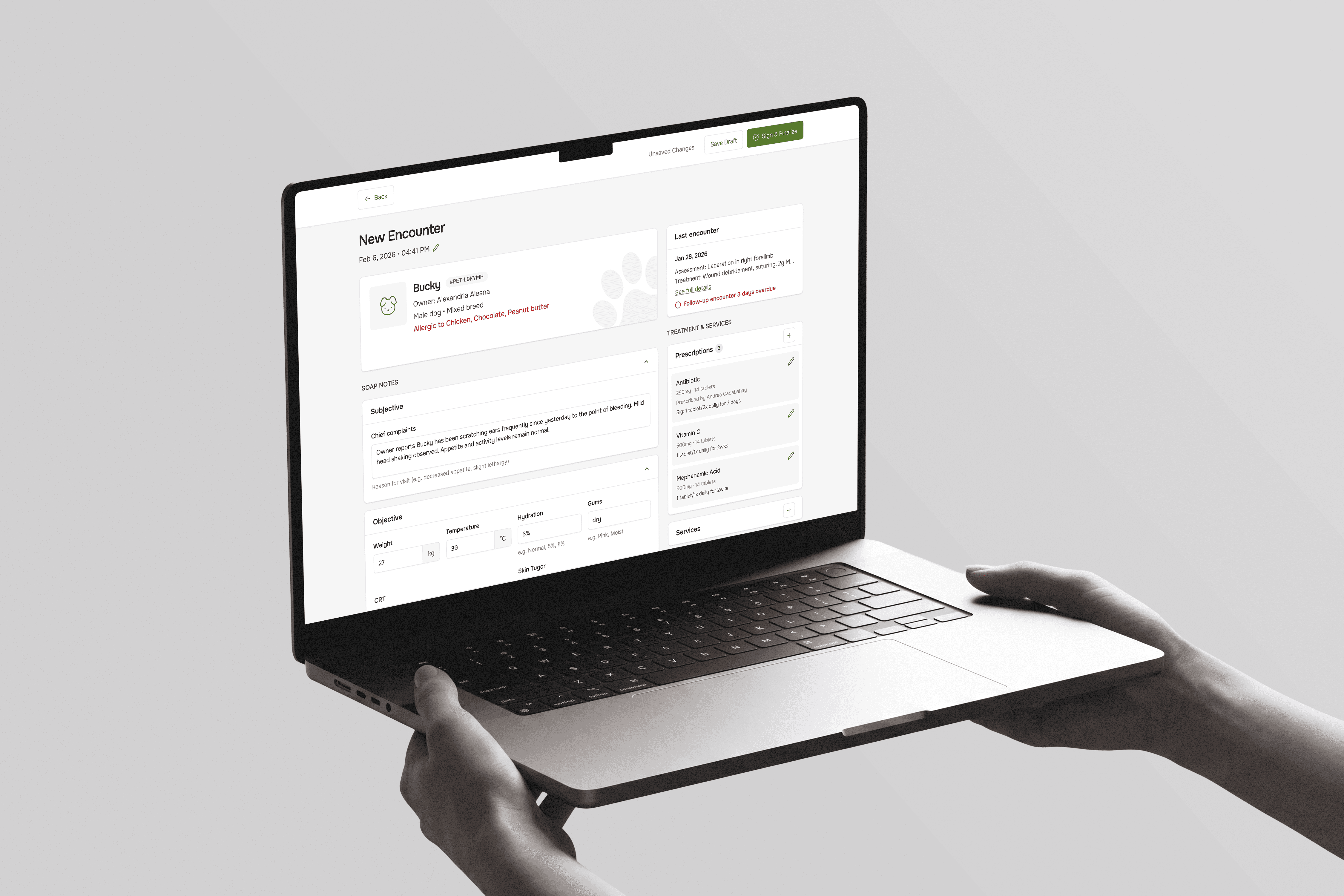
This page changed the most. The SOAP form now has the entire screen to itself. No patient profile tabs above it, no navigation context pulling focus:
The patient card at the top
The SOAP sections below
The treatments sidebar to the right
This is what it looks like when documentation gets its own space.
I designed the initial version, then handed it to a senior designer who refined it into what shipped. My starting instinct was to strip things back: fewer cards, more breathing room, closer to an Apple-style layout.
Part of that was aesthetic
Mostly it was about scalability
The fewer nested containers I introduced, the less this page would fight me when it collapsed to mobile
We went back and forth on components and on what this screen was actually responsible for. It was never just SOAP notes. Treatments and billing lived here too, so the open questions were:
How do final payments surface?
How do you display multiple products under a single service?
What information earns a spot on the screen and what doesn’t?
The clearest change was swapping the To-do panel for a Last Encounter summary. A to-do list felt redundant on a page you’re already inside of. You’re doing the task, so why show it back to you? What a vet actually needs at that moment is context:
What happened last visit
What was prescribed
What’s overdue
That’s the information that explains why this checkup is happening.
I stayed away from proposing new functionality, since I was an intern and scope wasn’t mine to expand. But sitting next to a designer who could translate all of this to the dev team, watching how she framed constraints and articulated tradeoffs, was the part I learned the most from.


Signed Encounter
After the signature, the record locks permanently
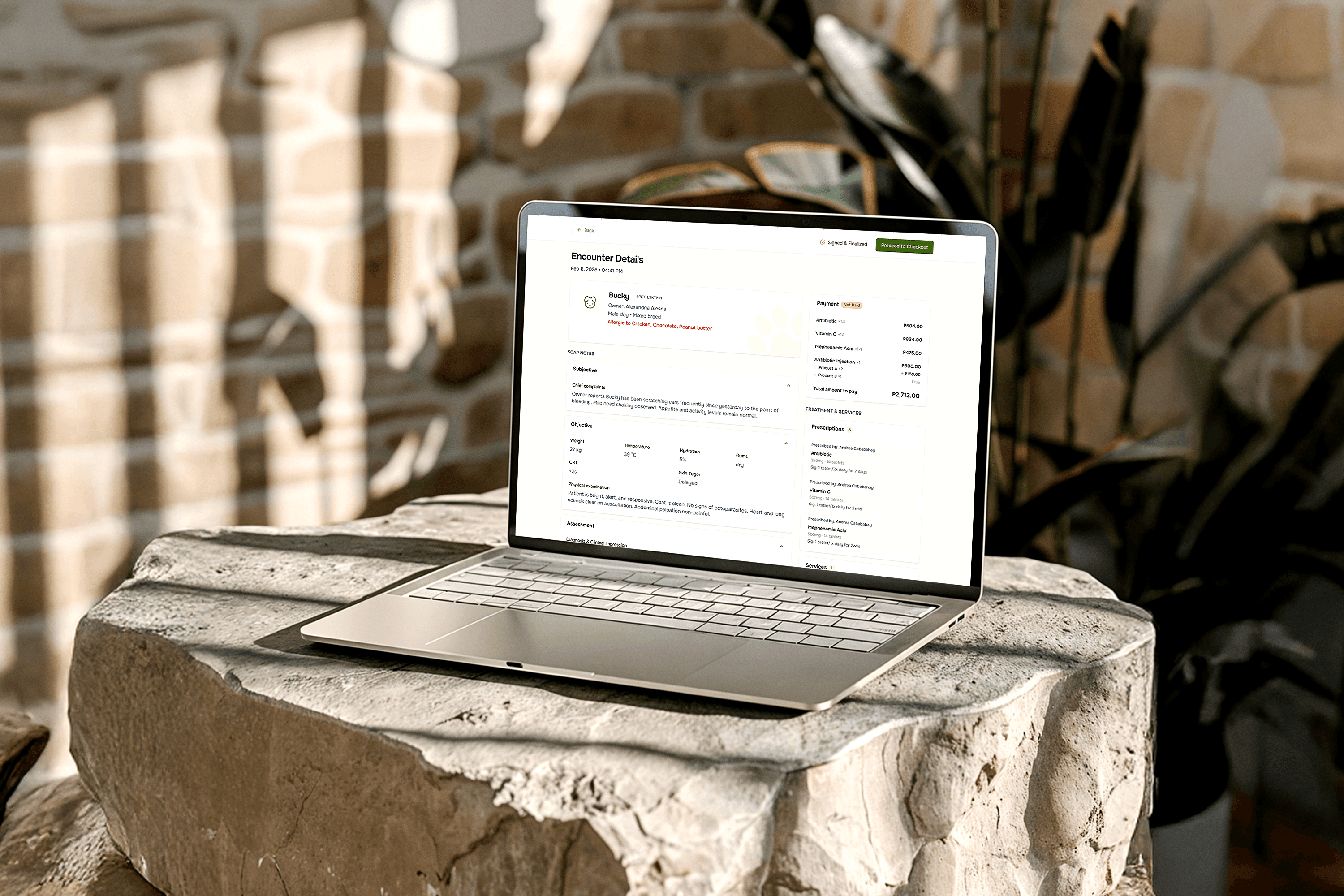
Sign & Finalize turns the encounter into a legal medical record. Three things change at once:
Fields go read-only
The draft notes become a finished summary
The button changes from Save Draft to Proceed to Checkout
I did the first version of this state and my senior reworked it. My version just kept the Treatments card from the editing screen, services listed, no total. But once a record is signed the vet isn’t reviewing treatments anymore, they’re collecting payment. So the final leads with a Payment card:
Line items, a total, and a Not Paid badge, sitting directly under the checkout button
Prescriptions linked to the bill, showing the same three meds twice
With prices under Payment
With prescriber and sig under Prescriptions
What the client pays, and what they need to know at home.
The products-inside-a-service problem was the one we kept circling. Antibiotic Injection uses Product A ×2 and Product B ×1, one of them free. Indenting them under the parent line was what finally made it read as one service instead of four separate charges.
My senior also caught the copy. I’d written “Sign And Finalized” and “Go to Billing”. Her notes:
Billing is a place, not an action. E-commerce doesn’t put you on a button labeled Billing, it says Checkout
Buttons start with verbs; status labels describe what already happened
So it became Signed & Finalized and Proceed to Checkout.


Background
My first internship, my first real product
MyPetCare was the first real product I worked on as a designer. It is a veterinary clinic management platform that helps clinics track patients, handle appointments, manage billing, and document medical records. When I joined as an intern, I was handed one of the most central features in the entire app: the Encounter Page.
An encounter is the full record of a single patient visit. It captures everything that happened during that appointment:
Observations and vitals
Diagnoses
Treatments
The handoff to billing
The structure existed. The SOAP framework was there.
But using it felt scattered:
Treatment actions lived in their own separate panel
The form was nested inside patient profile tabs
My job was to consolidate it. Make the experience feel like one coherent thing rather than several loosely connected pieces.
Everything a vet needed for a single visit should live on one page, in one flow.
Starting Point
What the encounter page looked like before
This is the original design. The encounter form lived inside the patient profile page, tucked under an Encounters tab. A ‘Back to List’ link sat inside the tab, not at the top level of navigation. Treatment options were split into a separate panel on the right with six individual action buttons.
New Flow
Separating the encounter list from the SOAP notes
The biggest structural change in this redesign was splitting what used to be one crowded page into two distinct ones. The encounter list became its own page, a place to find and manage records. Selecting a visit takes you to a completely separate documentation page where the patient profile tabs disappear and the vet just has the form.
Design Decision · Navigation
Organizing a flat nav into something scannable
The original sidebar was a single list of eight items with no hierarchy. As the product grew, more items kept getting added to the bottom. It worked when the app was small but became harder to parse as the feature set expanded.
Design Decision · Encounter Table
A table that follows familiar, well-tested patterns
Now that the encounter list had its own dedicated page, it made sense to treat it like a proper data table rather than a minimal embedded list. I took cues from patterns like Shopify’s admin tables: search, status filters, a total count, and a dedicated action column. These conventions exist for a reason. Vets and clinic staff already know how to use them.
Design Decision · Form Fields
Unit labels that stay visible as you type
For fields like weight and temperature, the original design used placeholder text to communicate the unit. The moment a vet started typing, the ‘kg’ or ‘°C’ disappeared. In a clinical setting where the wrong unit can mean something serious, that is not a small problem. Keeping the unit pinned outside the input, always visible, removes any ambiguity.
Encounter Form
The documentation page, nothing else competing for attention
This page changed the most. The SOAP form now has the entire screen to itself. No patient profile tabs above it, no navigation context pulling focus:
The patient card at the top
The SOAP sections below
The treatments sidebar to the right
This is what it looks like when documentation gets its own space.
I designed the initial version, then handed it to a senior designer who refined it into what shipped. My starting instinct was to strip things back: fewer cards, more breathing room, closer to an Apple-style layout.
Part of that was aesthetic
Mostly it was about scalability
The fewer nested containers I introduced, the less this page would fight me when it collapsed to mobile
We went back and forth on components and on what this screen was actually responsible for. It was never just SOAP notes. Treatments and billing lived here too, so the open questions were:
How do final payments surface?
How do you display multiple products under a single service?
What information earns a spot on the screen and what doesn’t?
The clearest change was swapping the To-do panel for a Last Encounter summary. A to-do list felt redundant on a page you’re already inside of. You’re doing the task, so why show it back to you? What a vet actually needs at that moment is context:
What happened last visit
What was prescribed
What’s overdue
That’s the information that explains why this checkup is happening.
I stayed away from proposing new functionality, since I was an intern and scope wasn’t mine to expand. But sitting next to a designer who could translate all of this to the dev team, watching how she framed constraints and articulated tradeoffs, was the part I learned the most from.
Signed Encounter
After the signature, the record locks permanently
Sign & Finalize turns the encounter into a legal medical record. Three things change at once:
Fields go read-only
The draft notes become a finished summary
The button changes from Save Draft to Proceed to Checkout
I did the first version of this state and my senior reworked it. My version just kept the Treatments card from the editing screen, services listed, no total. But once a record is signed the vet isn’t reviewing treatments anymore, they’re collecting payment. So the final leads with a Payment card:
Line items, a total, and a Not Paid badge, sitting directly under the checkout button
Prescriptions linked to the bill, showing the same three meds twice
With prices under Payment
With prescriber and sig under Prescriptions
What the client pays, and what they need to know at home.
The products-inside-a-service problem was the one we kept circling. Antibiotic Injection uses Product A ×2 and Product B ×1, one of them free. Indenting them under the parent line was what finally made it read as one service instead of four separate charges.
My senior also caught the copy. I’d written “Sign And Finalized” and “Go to Billing”. Her notes:
Billing is a place, not an action. E-commerce doesn’t put you on a button labeled Billing, it says Checkout
Buttons start with verbs; status labels describe what already happened
So it became Signed & Finalized and Proceed to Checkout.
Learning the fundamentals of craft
This is where I found out what pros actually pull inspiration from, like Mobbin. The app started pretty barebones, so a lot of the work was learning to section things properly and keep styles consistent across a project.
Workflow and collaboration
It was also my first real look at how a designer works day to day, from talking with other designers to handing off cleanly to developers. I learned to check with devs on what's actually feasible, because sometimes a feature isn't fully thought through, why it's even needed, or how it could be better. A lot of that came from auditing and constant feedback.
Scaling and mentorship
Scaling from desktop to mobile was another big one, since some components just have constraints and don't always look right across sizes. And I got to learn from a senior designer who taught me to use my tools properly almost entirely by watching how she worked.
Learning the fundamentals of craft
This is where I found out what pros actually pull inspiration from, like Mobbin. The app started pretty barebones, so a lot of the work was learning to section things properly and keep styles consistent across a project.
Workflow and collaboration
It was also my first real look at how a designer works day to day, from talking with other designers to handing off cleanly to developers. I learned to check with devs on what's actually feasible, because sometimes a feature isn't fully thought through, why it's even needed, or how it could be better. A lot of that came from auditing and constant feedback.
Scaling and mentorship
Scaling from desktop to mobile was another big one, since some components just have constraints and don't always look right across sizes. And I got to learn from a senior designer who taught me to use my tools properly almost entirely by watching how she worked.
More Work

AuscultAI
Building a heart screening tool
It is mobile-assisted intelligent system that helps support the early screening of heart abnormalities by analyzing heart sounds recorded through a smartphone. Using LSTM model, the system classifies heart sounds as normal or abnormal, providing a simple and accessible screening tool. AuscultAI is designed to assist medical professionals, especially in areas with limited access to specialized healthcare.

SchedRx
Turning a photo of a prescription into a medication schedule
SchedRx is an iOS app designed to simplify prescription management through Intelligent automation using OCR and NER. It reads printed prescriptions, extracts essential medical information, and generates medication schedules and reminders—customized for the Philippine context.