Rethinking Upload Media on FindMyShots
The Photos tab upload flow that photographers use after every shoot. On paper it sounds simple but the more I traced how someone actually moved through it, the more I noticed it was asking people to do things in an order that didn't match how they were thinking.
Role
Role
Designer
Designer
Status
Status
Complete
Complete
Year
Year
2026
2026
Tools
Tools
Figma
Figma
Problems
Two steps for what felt like one action
Choosing an album and uploading photos are the same decision from the user's perspective — but the old flow separated them into two modal steps. Users had to pick an album, click Next, then upload — with a Back button as their only escape if they changed their mind.
Solution
I merged album selection into the upload view so photographers upload directly inside the album they're already in. Duplicates now surface as a toast on the same page with an option to delete and retry — no restart, no lost progress. The drop box updates live, and after an error the user stays put and can keep uploading elsewhere.


Where things started
Two tabs doing one job
Inside the Photos section, the work was split across two tabs. Upload Media was where you pushed photos and videos up to an event. My Gallery was where you looked back at what you'd already shot. Two tabs, but really one job: uploading your media and seeing your media are the same thing from a photographer's point of view, and the split just made you toggle between them. You couldn't check what you'd uploaded without leaving the place you uploaded from, and you couldn't upload without leaving the place that showed your work.
So the tabs collapsed into one. The Photos tab now drops you straight into the event's gallery, where the albums, the drop zone, and everything you've already uploaded sit on the same page.
The whole thing runs on a single event card that changes with the event's state, so one component covers every situation a photographer lands in. If the event is published and open, the card offers to upload, and once you've contributed it keeps an upload button up top with a way to view the album underneath. If you haven't registered for an upcoming event yet, it asks you to register first. If the upload window has closed, it drops the upload action and just lets you view what's there. Even an unpublished event stays reachable to the organization that owns it. The card carries the event's identity the whole time, its title, shot count, date, location, and organizer, and swaps only its main action. There's no separate upload screen to go find. The action lives on the event itself.


User Flow
Mapping the old flow against the revised one
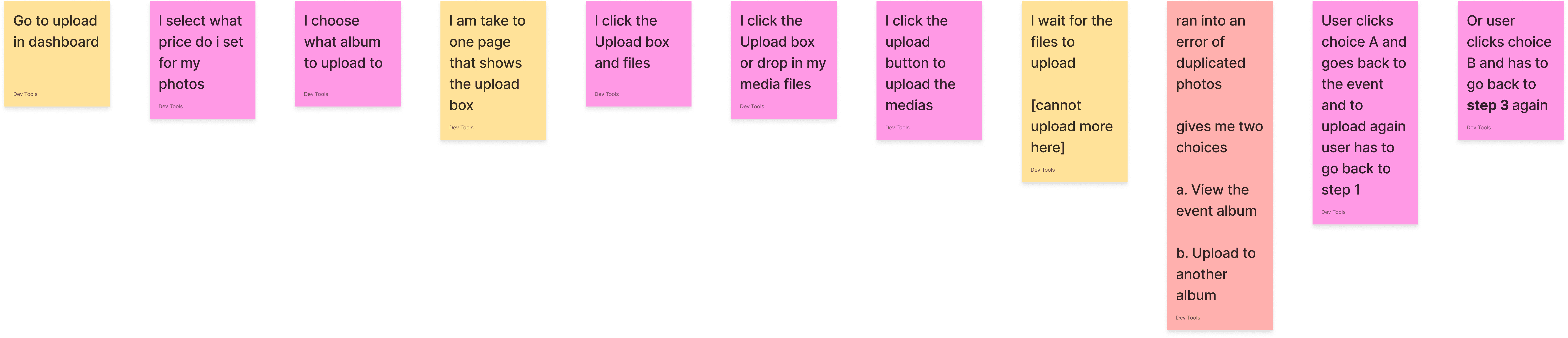
Before touching any screens, I mapped the whole thing out as a user journey, the old flow on top and the revised one below.
The old flow runs clean right up until the upload hits a duplicate, and then it forks into a dead end. Both choices the user is offered, view the event album or upload to another album, throw them back to the start to try again. Laying it out this way is what made the real problem obvious. It was never the error itself. It was that recovering from the error cost the user everything they'd already done.
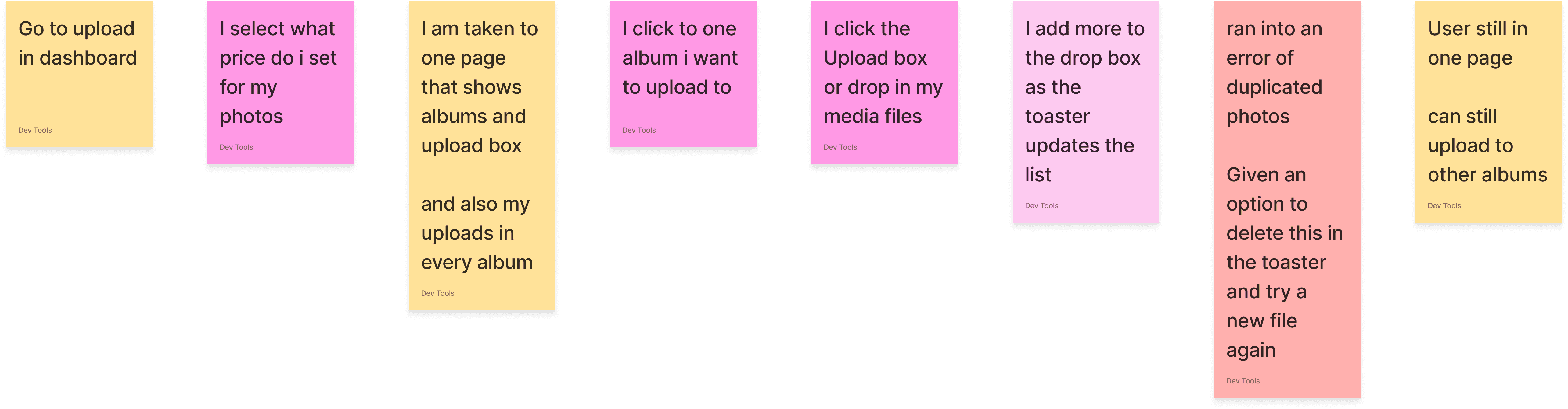
The revised flow keeps everything on one page. The albums and the drop box live together, the toast updates the list as files come in, and that same duplicate now shows up as a row in the toast with a fix right there. The user never leaves, and can keep uploading to other albums.
Design Principles
How I made the calls
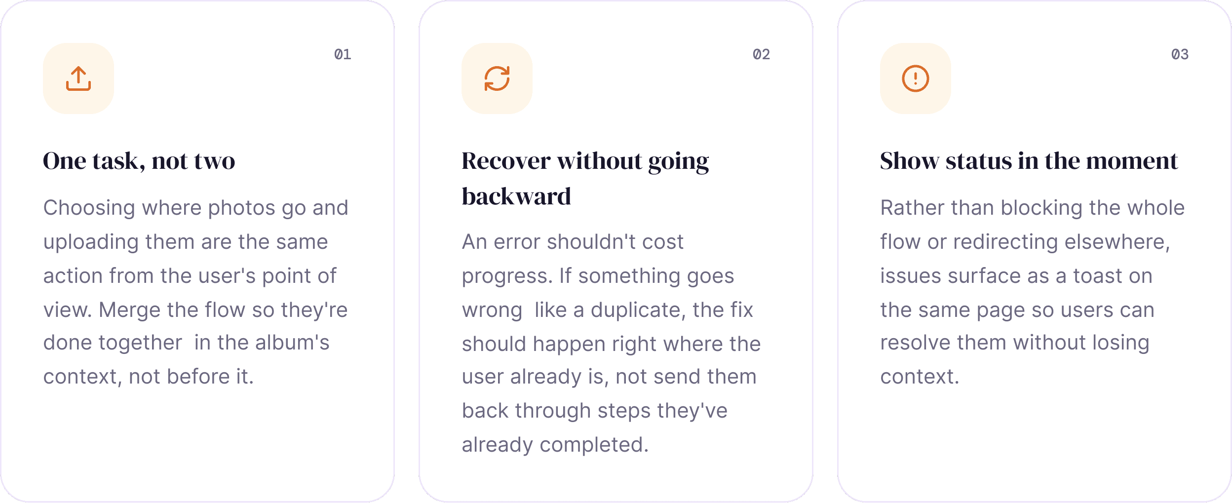
Underneath the specific changes, there were three ideas I kept checking my decisions against.
The redesign
Upload inside the album, not before it
Before, you picked an album first and then uploaded. Now you start inside the album and upload from there.
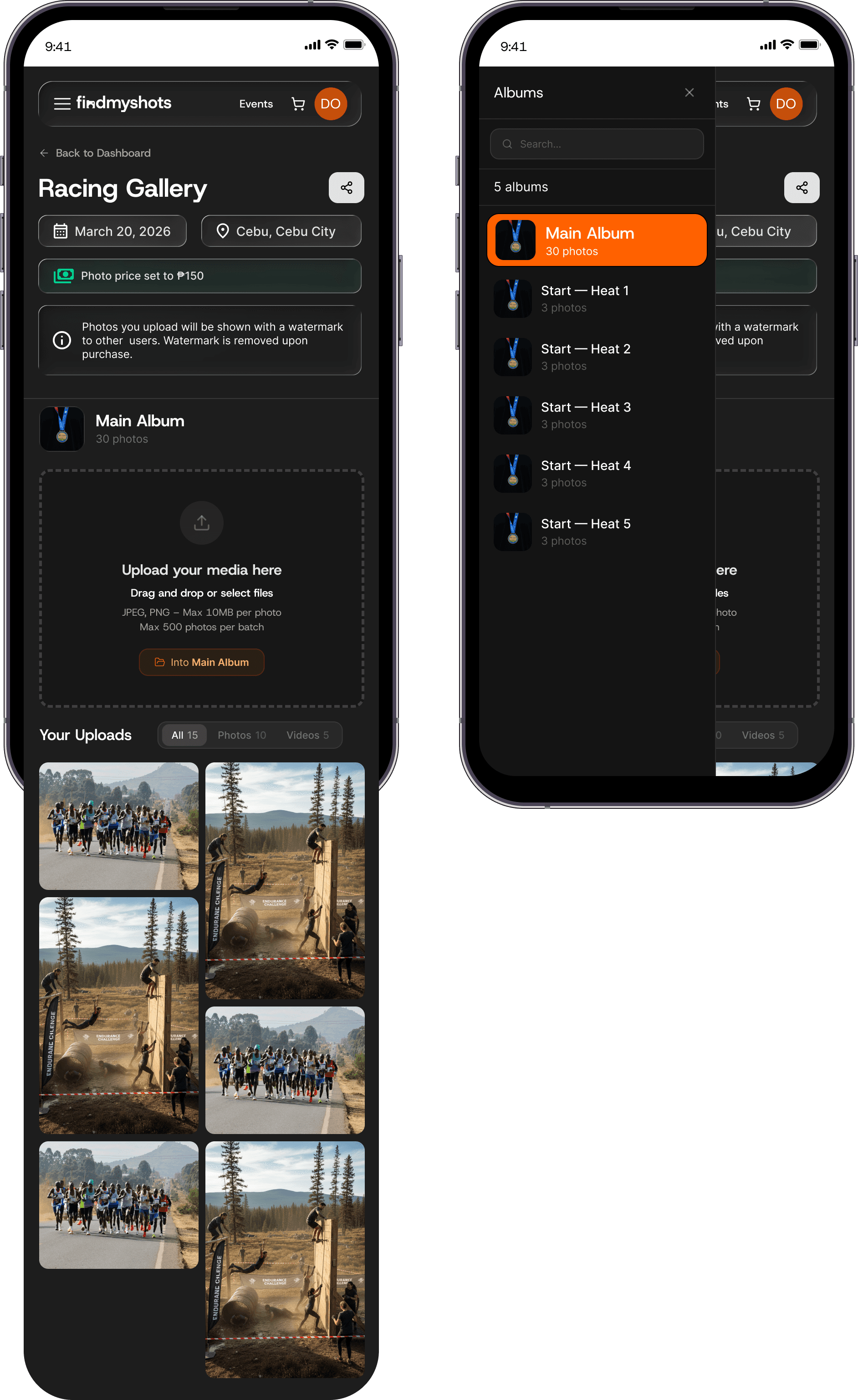
The album list sits on the left, searchable, with a count next to each one. The drop zone belongs to whichever album you're in. If you're in Main Album, files drop into Main Album.
The list stays put as you click around, so you're not stuck with one album for the whole session. Finish in one, click into the next, keep dropping. Nothing resets, and you can always see where a photo is going.
This matters most when an event has a lot of albums. The full list is always right there, so you never have to leave what you're doing to go find it.
The toast is the whole flow
Status, progress, and errors in one place

The toast is now the upload interface, not just a notification. It works like Google Drive. Each file gets its own row in a stack in the corner.
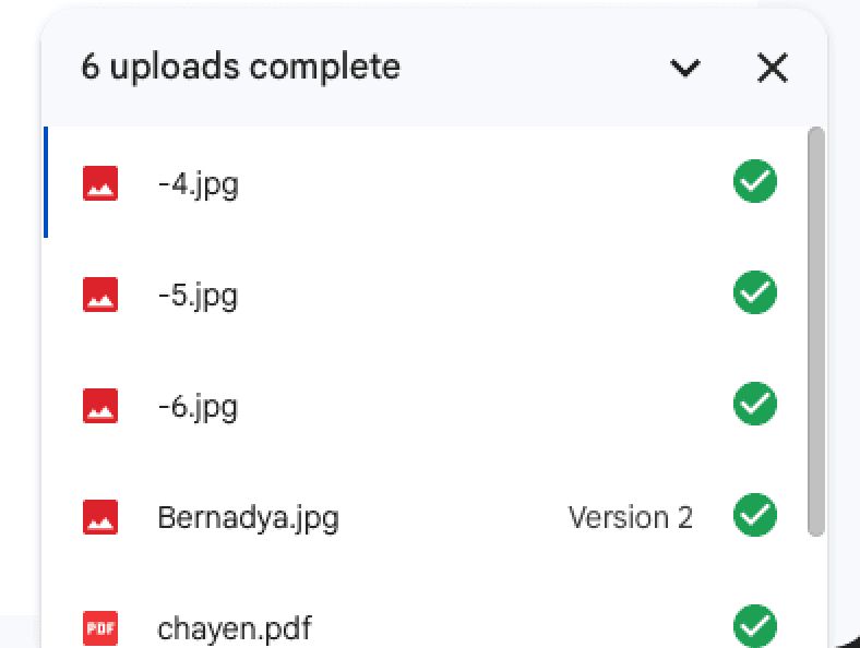
Each row shows its own state: still uploading, done, or failed. You can dismiss any of them with an ×. When they all finish, the toast collapses to one line. It never blocks the page.
Because the toast handles all of this, I removed two things.
First, the Upload button. Dropping files already starts the upload, so there was no reason to press a second button after.
Second, the success pop-up. The old 'Upload Complete' modal only told you what the toast was already showing, so I cut it. Now the last row just turns to Uploaded and you keep going.
Errors work the same way. Before, one duplicate closed the modal and sent you back to the start, losing the whole queue. Now a bad file is just one row with an error and a fix. The rest keep uploading, and you handle the one file without leaving the page.

Killing the bulk-upload page
One path that scales, instead of two
There used to be a separate page just for large uploads, up to 500 photos at once. It existed because the normal upload couldn't handle that volume yet. So photographers had to pick between normal upload and bulk upload before they started.
Once the normal upload could handle the volume, the separate page wasn't needed.
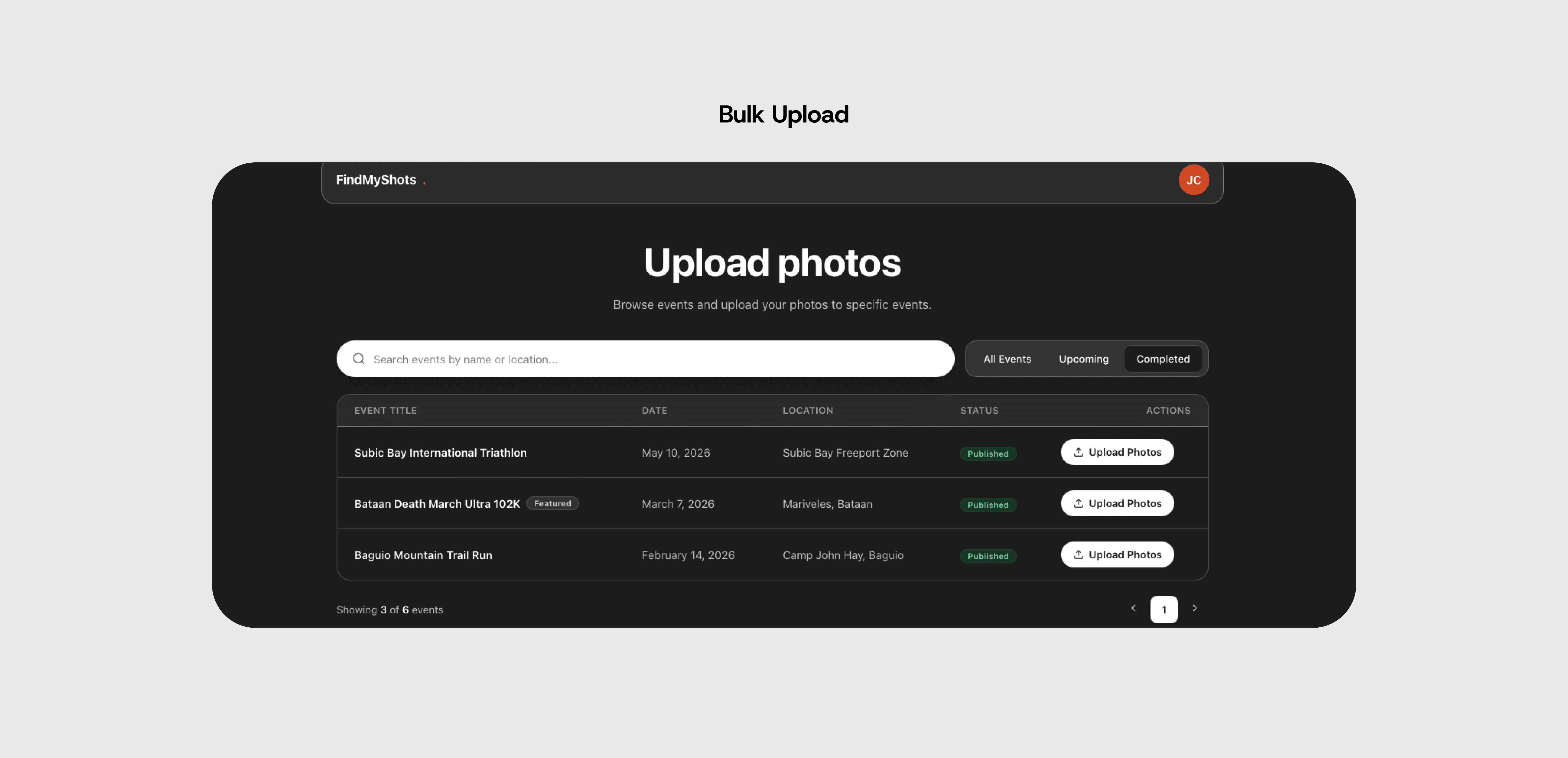
So I removed it. The 500-photo limit now lives on the normal drop zone. A small drop and a huge drop go to the same place, and photographers no longer have to choose which tool to use.
Photos, videos, and mobile
Both media types, in the same view
Photographers upload videos too, not just photos. So under the drop zone, Your Uploads shows everything in one grid. A filter at the top switches between All, Photos, and Videos, each with a count. You can see what you've uploaded without leaving the album.
Mobile works the same way. The album list moves into a menu, the event details stack into pills, and the grid becomes two columns. The drop zone, filter, and toast all stay. There's no separate mobile version to maintain.
Where things started
Two tabs doing one job
Inside the Photos section, the work was split across two tabs. Upload Media was where you pushed photos and videos up to an event. My Gallery was where you looked back at what you'd already shot. Two tabs, but really one job: uploading your media and seeing your media are the same thing from a photographer's point of view, and the split just made you toggle between them. You couldn't check what you'd uploaded without leaving the place you uploaded from, and you couldn't upload without leaving the place that showed your work.
So the tabs collapsed into one. The Photos tab now drops you straight into the event's gallery, where the albums, the drop zone, and everything you've already uploaded sit on the same page.
The whole thing runs on a single event card that changes with the event's state, so one component covers every situation a photographer lands in. If the event is published and open, the card offers to upload, and once you've contributed it keeps an upload button up top with a way to view the album underneath. If you haven't registered for an upcoming event yet, it asks you to register first. If the upload window has closed, it drops the upload action and just lets you view what's there. Even an unpublished event stays reachable to the organization that owns it. The card carries the event's identity the whole time, its title, shot count, date, location, and organizer, and swaps only its main action. There's no separate upload screen to go find. The action lives on the event itself.
User Flow
Mapping the old flow against the revised one
Before touching any screens, I mapped the whole thing out as a user journey, the old flow on top and the revised one below.
The old flow runs clean right up until the upload hits a duplicate, and then it forks into a dead end. Both choices the user is offered, view the event album or upload to another album, throw them back to the start to try again. Laying it out this way is what made the real problem obvious. It was never the error itself. It was that recovering from the error cost the user everything they'd already done.
The revised flow keeps everything on one page. The albums and the drop box live together, the toast updates the list as files come in, and that same duplicate now shows up as a row in the toast with a fix right there. The user never leaves, and can keep uploading to other albums.
Design Principles
How I made the calls
Underneath the specific changes, there were three ideas I kept checking my decisions against.
The redesign
Upload inside the album, not before it
Before, you picked an album first and then uploaded. Now you start inside the album and upload from there.
The album list sits on the left, searchable, with a count next to each one. The drop zone belongs to whichever album you're in. If you're in Main Album, files drop into Main Album.
The list stays put as you click around, so you're not stuck with one album for the whole session. Finish in one, click into the next, keep dropping. Nothing resets, and you can always see where a photo is going.
This matters most when an event has a lot of albums. The full list is always right there, so you never have to leave what you're doing to go find it.
The toast is the whole flow
Status, progress, and errors in one place
The toast is now the upload interface, not just a notification. It works like Google Drive. Each file gets its own row in a stack in the corner.
Each row shows its own state: still uploading, done, or failed. You can dismiss any of them with an ×. When they all finish, the toast collapses to one line. It never blocks the page.
Because the toast handles all of this, I removed two things.
First, the Upload button. Dropping files already starts the upload, so there was no reason to press a second button after.
Second, the success pop-up. The old 'Upload Complete' modal only told you what the toast was already showing, so I cut it. Now the last row just turns to Uploaded and you keep going.
Errors work the same way. Before, one duplicate closed the modal and sent you back to the start, losing the whole queue. Now a bad file is just one row with an error and a fix. The rest keep uploading, and you handle the one file without leaving the page.
Killing the bulk-upload page
One path that scales, instead of two
There used to be a separate page just for large uploads, up to 500 photos at once. It existed because the normal upload couldn't handle that volume yet. So photographers had to pick between normal upload and bulk upload before they started.
Once the normal upload could handle the volume, the separate page wasn't needed.
So I removed it. The 500-photo limit now lives on the normal drop zone. A small drop and a huge drop go to the same place, and photographers no longer have to choose which tool to use.
Photos, videos, and mobile
Both media types, in the same view
Photographers upload videos too, not just photos. So under the drop zone, Your Uploads shows everything in one grid. A filter at the top switches between All, Photos, and Videos, each with a count. You can see what you've uploaded without leaving the album.
Mobile works the same way. The album list moves into a menu, the event details stack into pills, and the grid becomes two columns. The drop zone, filter, and toast all stay. There's no separate mobile version to maintain.
Audits and component consistency
This project kicked off with audits run by other designers, which I turned into proposed designs. There were quite a few inconsistencies in the components, and sorting those out was the real challenge. I also helped document new components, from buttons to type.
Frontend development and QA
I did a lot of frontend here too, actually coding my own designs. I'll be honest, it's pretty hard. There are MCP tools now that help turn design into code, but the details matter so much: spacing, color, font size, margins, all of it, and scaling most of all. Along the way I also did audits, took on QA, wrote my own tickets, and helped with staging.
Working under a mentor
I was lucky to have a great mentor on this project. He taught me a ton about setting up code environments and working with Git, stuff that made the development side a lot more manageable.
The upload flow and stakeholders
Most of all, the upload flow was the heart of it. Designing it end to end was tough enough on its own, and then there were the stakeholders. I spent a lot of time pushing on constraints, asking whether something was possible when the UX clearly needed to work a certain way. In the end, a lot of it came down to getting that green light.
Audits and component consistency
This project kicked off with audits run by other designers, which I turned into proposed designs. There were quite a few inconsistencies in the components, and sorting those out was the real challenge. I also helped document new components, from buttons to type.
Frontend development and QA
I did a lot of frontend here too, actually coding my own designs. I'll be honest, it's pretty hard. There are MCP tools now that help turn design into code, but the details matter so much: spacing, color, font size, margins, all of it, and scaling most of all. Along the way I also did audits, took on QA, wrote my own tickets, and helped with staging.
Working under a mentor
I was lucky to have a great mentor on this project. He taught me a ton about setting up code environments and working with Git, stuff that made the development side a lot more manageable.
The upload flow and stakeholders
Most of all, the upload flow was the heart of it. Designing it end to end was tough enough on its own, and then there were the stakeholders. I spent a lot of time pushing on constraints, asking whether something was possible when the UX clearly needed to work a certain way. In the end, a lot of it came down to getting that green light.
More Work

AuscultAI
Building a heart screening tool
It is mobile-assisted intelligent system that helps support the early screening of heart abnormalities by analyzing heart sounds recorded through a smartphone. Using LSTM model, the system classifies heart sounds as normal or abnormal, providing a simple and accessible screening tool. AuscultAI is designed to assist medical professionals, especially in areas with limited access to specialized healthcare.
SchedRx
Turning a photo of a prescription into a medication schedule
SchedRx is an iOS app designed to simplify prescription management through Intelligent automation using OCR and NER. It reads printed prescriptions, extracts essential medical information, and generates medication schedules and reminders—customized for the Philippine context.